It’s one thing to collect financial data. It’s another to turn that data into insights your team can act on. A well-built financial dashboard delivers clarity, not confusion. In this guide you’ll learn how to create a financial dashboard that actually makes sense for you, your team and your business objectives.
We’ll walk you through: picking the right key performance indicators (KPIs), structuring the layout, choosing visuals, integrating data sources and applying best-practices so that your dashboard becomes a decision-making tool, not just a pretty screen.
1. Define Your Purpose and Audience
Before you build, ask: What decisions will this dashboard support? and Who will use it? According to best practices, dashboards succeed when they answer user questions clearly.
Key points
-
Identify a focus question: e.g., “What is our current cash runway?” or “Are our margins slipping this quarter?
-
Define user roles: executive (overview), manager (detail), analyst (deep dive). Tailor views accordingly.
-
Limit scope initially: starting with too many metrics bids chaos. Keep it targeted.
By beginning with purpose and audience the rest of the design follows with clarity.
2. Select Strategic KPIs for Your Dashboard
Your dashboard must track metrics that matter. It’s not about showing everything; it’s about showing what drives decisions.
Core KPIs often include
-
Revenue & gross profit & net profit margins.
-
Cash flow: inflows, outflows, runway.
-
Expense tracking, budget vs actual.
-
Debt levels or liabilities owed.
-
Variance indicators: actual vs plan, actual vs prior year.
Selection guidance
-
Pick KPIs that tie directly to your business goals (growth, profitability, liquidity).
-
Avoid metrics that look nice but don’t trigger action. If it doesn’t lead to what do we do next, leave it out.
-
Use benchmarks (plan, forecast, prior period) to give KPIs meaning.
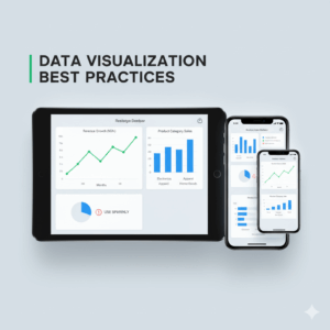
3. Designing Layout & Visuals that Make Sense
A dashboard can have world-class data but still fail if the design is poor. Design wisely.
-
Use a visual hierarchy: most important metrics at the top/left.
-
Group related metrics: e.g., cash flow metrics together, revenue metrics together.
-
Use whitespace and avoid clutter: dashboards with fewer visual elements are faster to read.
Visuals & styling
-
Select appropriate chart types: line charts for trends; bar charts for comparisons; pie charts sparingly.
-
Use consistent colors and labels: e.g., green for positive, red for negative; clear units.
-
Make it responsive: consider mobile/tablet views if your stakeholders use them.
4. Integrate Data Sources and Ensure Accuracy
Behind the scenes, a dashboard is only as good as its data. Integration and quality matter.
Integration essentials
-
Pull data from your accounting system, CRM, spreadsheets, bank feeds etc.
-
Automate refresh. Manual updates lead to stale or inconsistent dashboard.
-
Set data validation checks: compare sources, check anomalies/faults.
Accuracy & governance
-
Always include “Last updated: [date/time]” so users trust the data.
-
Role-based access: ensure sensitive financial info is viewable only by the right people.
-
Periodically audit the dashboard: ensure its metrics still align with your business reality and strategy.
5. Build Interactivity, Alerts & Drill-Downs
A static dashboard may look pretty but won’t drive insight. Add interactivity so users can explore and act.
Functional features
-
Filters for time period, business unit, region etc.
-
Drill-down: click a high-level KPI to see its drivers (e.g., margin drop → COGS rise).
-
Alerts / conditional formatting: highlight when a KPI crosses a threshold.
-
Custom dashboards/views per role: tailor what each user needs to see.
Action orientation
-
Each metric should prompt a question or action: “Why is revenue dropping?” vs just “Revenue = $X”.
-
Provide context or “next step” guidance if possible (annotations, tool-tips).
6. Maintain & Improve Your Dashboard Over Time
Your dashboard is not a one-and-done project. It needs evolution.
Ongoing practices
-
Review quarterly: are the KPIs still aligned with business goals?
-
Conduct user feedback: Does the dashboard still make sense for its users?
-
Keep refining visuals and features: maybe add new KPIs, retire old ones, refine layout.
-
Monitor performance: if dashboards load slowly, trim data or optimize model.
Conclusion & Call to Action
Creating a financial dashboard that makes sense isn’t just about software or charts. It’s about purpose, clarity, action, and trust. When you define the right KPIs, structure the layout thoughtfully, integrate reliable data and add interactive features, you build a tool that empowers your team to make informed decisions.
At Zaccheus we help startups, freelancers and SMEs turn their financial data into meaningful dashboards and insights without the overhead of a full finance team. Ready to see your numbers clearly and act confidently? Explore our AI-CFO solution today.
FAQ
Q1: What tool should I use to build a financial dashboard?
You can use BI tools like Power BI, Tableau, or look for embedded dashboard features in your accounting software. Choose one that supports your data sources, refresh needs and user skills.
Q2: How many KPIs are too many?
If users must scroll endlessly or spend minutes just understanding the dashboard, it’s too much. Keep the first view simple (5-7 critical KPIs) and allow drill-downs for detail.
Q3: How often should my dashboard update?
That depends on your business needs. For fast-moving startups you might need daily or real-time updates. For others weekly or monthly may suffice, just ensure everyone knows the “last updated” timestamp.
Q4: Can a dashboard replace financial reports?
It can supplement and in many cases reduce the reliance on static reports by providing live insights. But detailed financial statements (P&L, balance sheet) still have their place. Use dashboards for insight and guidance; use reports for compliance and official filings.
Q5: My team ignores the dashboard. What do I do?
Revisit your design and audience alignment. Maybe the KPIs don’t match their daily decisions. Conduct a user feedback session, simplify the interface and emphasise the “why” behind each metric.